Action bar
- Experimental
- Review pending by accessibility team

Anatomy
And action bar is a wrapper for different kinds of actions. It handles alignment and responsiveness without much configuration.

Items
Each action bar item requires a visual and a label.
visual: An icon to represent the actionlabel: Text describing the action of the item
Note that depending on the variant used, the visual or label might not be visible at all times.

Dividers
Use a divider to visually separate items of the same type. No divider is needed between an icon and a button since they are already distinctive enough.

Overflow menu
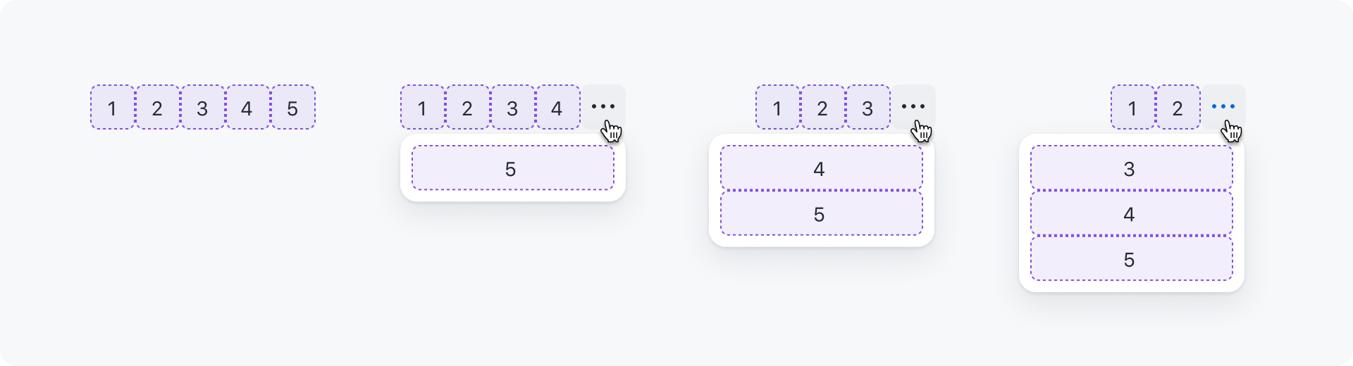
When action bar items don't fit in the available space, an overflow button ("kebab" icon) is added at the end of the action bar signaling that there are more actions available. Clicking on the overflow button opens the overflow menu with the remaining actions that didn't fit.

Sorting
Actions that don't fit are added to the top of the menu. Meaning that the last action in the action bar will also be the last action inside the menu. Make sure to add the most important actions to the front since they will be hidden last.
Demo
Overflow button appears when not enough space and resizing the action bar updates the overflow menu.
Options
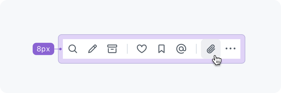
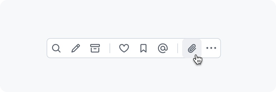
Gap
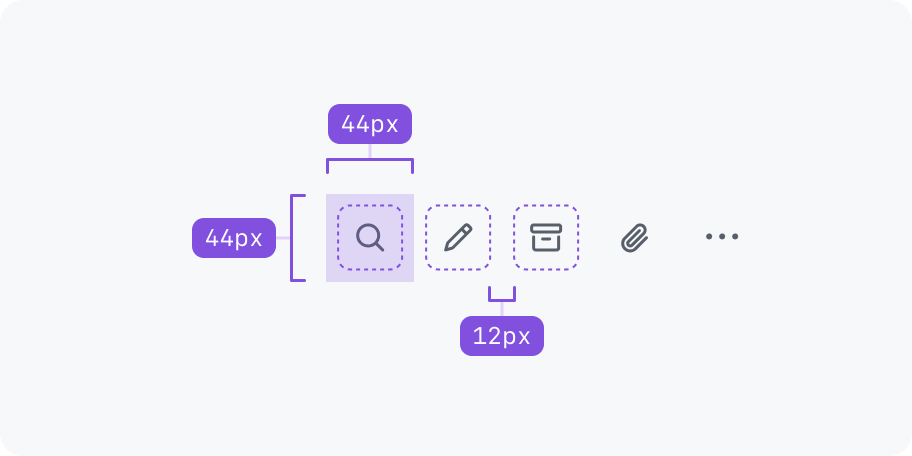
Action bar items use an 8px gap by default. There is also a more spacious 12px option available. Note that there is no gap between icons as they already have padding and no border.

Size
An action bar can have 3 different sizes: Small (28px), default (32px) and large (40px).

Max visible
An action bar can be configured to limit the amount of items that are visible, even if enough space is available. This helps to not overwhelm users with too many actions. In the example below the maxVisible is set to 2. So the rest of the actions are available from the overflow menu.

Item variant
An action bar item can be configured with different variants to adjust its rendering based on the environment or use case.
Icon only
A variant of icon renders an action only as an icon. It is a great option when lots of actions should be shown together like in a toolbar.

Only use "invisible" icon buttons.

Don't use other icon button variants.
Button
When there are only 2-3 actions and enough space, consider using the button variant. For destructive actions the dangerButton variant should be used.

Use default or danger buttons when space allows.
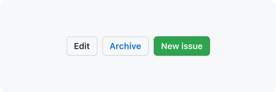
Don't use other variants. Primary buttons can still be used next to an action bar, just not within it.
Button with icon
Use the buttonWithIcon or dangerButtonWithIcon variants to add leading visuals to buttons.

Use leading visuals to emphasis an action's meaning.

If one of the buttons has a leading visual, then all other buttons should have one too.
Icons and buttons mixed
You may use icons and buttons in the same action bar.

Use buttons to make an action stand out more against the rest of the icons.

Don't add leading visuals to buttons if the action bar also has icons.
Layout
Action bars can be used inline next to other content or take up the entire available space.

Spacing
Make sure to add extra spacing around the action bar.
Extra padding of 8px is added when nesting an action bar in a box component.
Avoid having the action bar touch something else. Even though the action bar buttons have no borders in their resting state, when hovering/pressing a button it will show a background color.
Accessibility
Role
An action bar has an ARIA role of toolbar.
Keyboard navigation
| Key | description |
|---|---|
Tab | Moves focus into and out of the action bar. Note that there should only be one tab-stop and pressing tab again should focus the next focusable element after the action bar. Also the first button is focused if the action bar is receiving focus for the first time after page load. Otherwise, the most recently focused button receives focus. |
→ | Right arrow moves focus to the next button. If the last button has focus, focus loops back to the first button. |
← | Left arrow moves focus to the previous button. If the first button has focus, focus moves to the last button. |
Home | Moves focus to the first button. |
End | Moves focus to the last button. |
Enter or Space | Triggers the button action. |
Tooltips
When hovering over an action, a tooltip with a description appears.

Describe what action will be taken when clicking on the button.
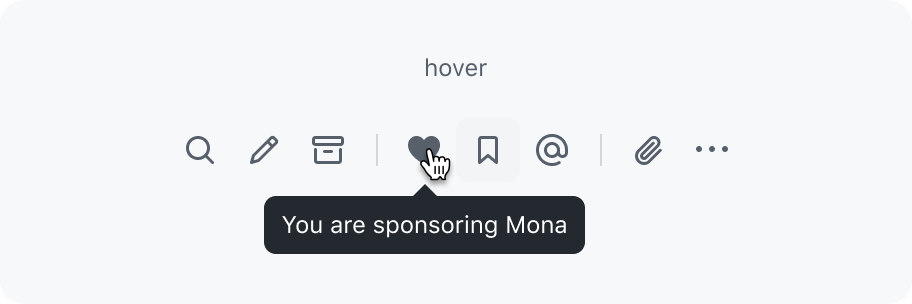
Don't use a tooltip in action bars to convey a current state.
Touch targets
Ensure action bar buttons have a large enough touch target size (44px by 44px). The buttons should respond to hovers, clicks, and taps anywhere in the touch target area, even if it isn't directly on the control. To avoid overlapping of touch targets, additional space between each button is needed (for example a 12px gap for medium sized buttons).